| Asian fit protective facemasks by MDes in Design Practices | Anita Law |

| CONTINUE READING THIS ARTICLE>> | 29.09.09 | No Comments » |
| IKEA: From Futura to Verdana | Mandy So |

IKEA has officially changed their customized Futura typeface, IKEA Sans, to Verdana, a font designed for Microsoft for screen viewing.
For those who haven’t heard, there has been a lot of outrage for this move by many IKEA- and type-lovers. The reason for this change is to synchronize the online and printed look for IKEA. As a member of the marketing team, I understand the need to create a unified identity. But as a designer, when you have a customized Futura typeface that has been working for you all these years, you just don’t abandon it and replace it with a default just so you can have everything look similar. No layman notices anyway and the ones that do notice really appreciate the aura that IKEA Sans sends out.
What are your thoughts for this hideous face-drop?
Read more from other indignant designers.

| CONTINUE READING THIS ARTICLE>> | 24.09.09 | 1 Comment » |
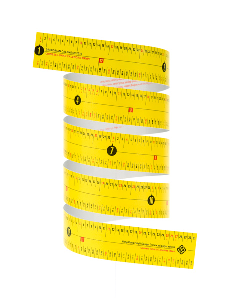
| Convert Time to Timeless Ideas | Mandy So |
Tape-calendar souvenir available this Saturday (September 26, 2009) at PolyU Design Annual Open Day 2009


| CONTINUE READING THIS ARTICLE>> | 23.09.09 | No Comments » |
| Cultural Research | Thomas FISCHER |
This is a lecture delivered to about 140 second-year BA(Hons) in Design students at The Hong Kong Polytechnic University in early September 2009, as part of a subject titled “Cultural Research”.

| CONTINUE READING THIS ARTICLE>> | 15.09.09 | No Comments » |


