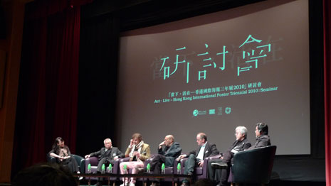
The Seminar panel
From left to right: Grace Lau (moderator), Kan Tai-keung, Mathias Augustyniak, David Tartakover, Michel de Boer, Kenya Hara, and Eddie Yu (moderator)
I attended the Seminar held under the HK International Poster Triennial this year with six speakers who spoke about their poster design and cultural influences. Each designer was distinct in their approach and style. To start off the afternoon, Kan Tai-keung from Hong Kong walked the audience through his signature calligraphic illustrative posters. Following was Mathias Augustyniak from France, who is 1/2 of M|M and reminded us every now and then, between his 52 hand-drawn typographic posters for a French theatre company, that he was stuck in Hong Kong due to the Icelandic volcano eruptions. Grace Lau, one of the moderators and PolyU Design alum, stood in for Stanley Wong, who was stuck in England due to the eruptions. Before the break, Michel de Boer and Joost Roozekrans ran through their two-part presentation, directing their first half to students speaking about bunch designing and lateral thinking, and borrowing the six creative hats idea from Edward de Bono. de Boer is founder of Studio Dumbar, and he flipped through the evolution of posters by his firm since the 80s.
Kenya Hara was the highly-anticipated speaker of the day. His theories on “emptiness” and examples from the Muji brand helped to convey the cavity for thought that a seemingly empty poster encompasses. His concepts are rooted in Japanese belief and culture. As with David Tartakover, an Israeli man with many roles (he is a graphic designer, curator, poster and toy collector, and political activist), whose works are reactions to the political situation in his home country. He creates work that resonate with those in Tel Aviv. Tartakover came to PolyU Design in 2007 to give a short presentation of his portfolio.
All in all, the seminar provided a peek into each designer’s work and style. Some made more sense than others but in fact all speakers were somewhat irrelevant to us practicing design in Hong Kong. Some say that European and Japanese design have a more decorative quality to them while American design focuses a lot more on functionality. Perhaps, Hong Kong is more American in this way but it has managed to make it its own by going overboard with functionality. Posters are filled to the edge with information in case any one person in the audience should miss any vital information. Therein, magically converting them into the leaflet-poster, or as we like to say in Hong Kong, “intestines are drawn out” for the audience. Optimistically speaking, Hong Kong has room to adapt and explore some of the theories and practices of these five designers but whether the intentions will still be there, that’s another story.


